
colours of wolwedans – visual language colour palette
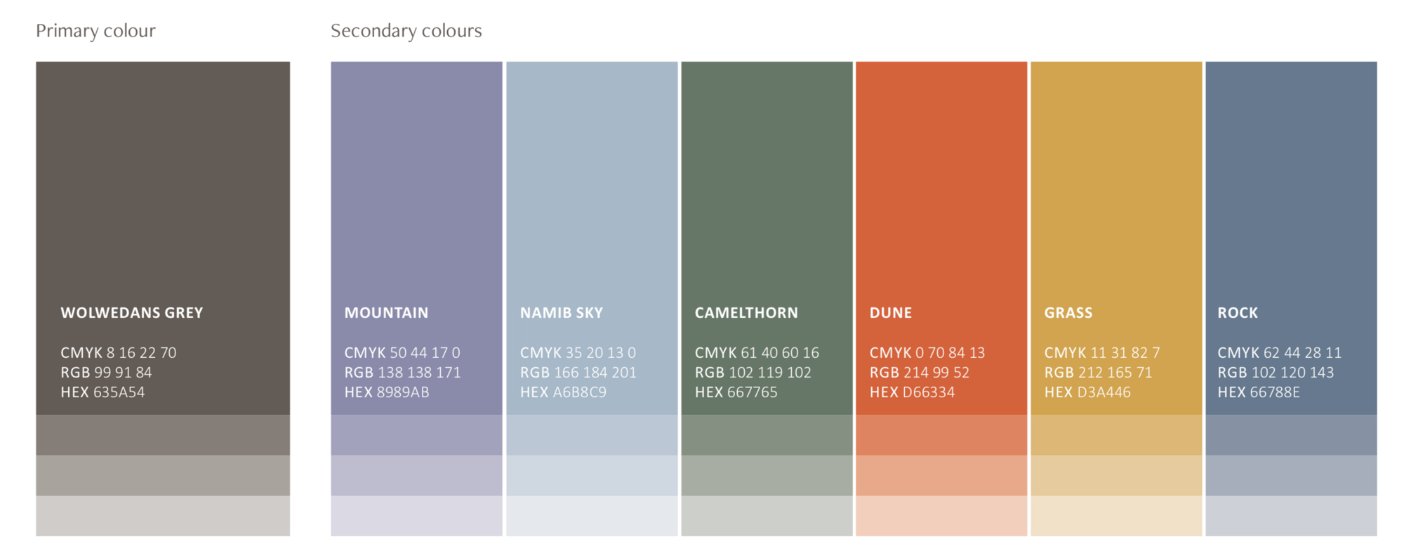
The Wolwedans colour palette takes inspiration from the NamibRand landscape – dark grey of the rocks, blue of the sky, violet of the mountains, red of the dunes, ochre of the grass, olive greens of the Camelthorn trees and lighter shades of green for other endemic plants like the Hoodia.
The AridEden Project logo makes use of all colours, as does our 25th anniversary logo and the 5Cs logo. All can be used in either monotone or in reverse. Colours may also be used in tints, e.g. the Wolwedans wordmark is a 50% tint of Wolwedans grey while the Happy Being icon can be used in all colours and in tints, depending on its application.