
logos explained
Wolwedans' re-branding in 2020 – the year of our 25th Jubilee – required extensive brainstorming and soul searching to create something that was authentic to Wolwedans and portrayed what we are all about. The result embraced the "pursuit of happiness” as our purpose and the introduction of “Consciousness” into our strategic 5Cs mix. It comprised 3 visuals;
- A plain, handwritten wordmark "Wolwedans” – the word is the brand
- The AridEden logo – clearly symbolizing our purpose with people at the heart of all we do
- The happy being icon – depicting the "pursuit of happiness" for all
The Wolwedans wordmark is used for all entities with an accompanying descriptor, e.g. Collection, Foundation, camps, programmes, etc. while the AridEden and happy being visuals are used for the Foundation, The AridEdenProject, and 5Cs as well as future merchandising (especially the happy being for the latter). These visuals symbolize a burst of energy, placing people and their happiness at the heart of everything – required elements in all that we do through our 5Cs sustainability framework and respective projects under Matrix | 25. The three degree tilt of the happy being symbolises forward movement – working towards a better tomorrow and our vision for the future.
Wolwedans
A simple wordmark with a descriptor for relevant entities, e.g. Collection, Foundation, camps & programmes
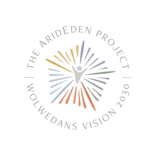
AridEden
The AridEden logo represents the 5Cs of our Matrix | 25 with happiness at the heart of all we pursue

Happy Being
The happy being icon – depicting people and the pursuit of happiness for all (guests, team and community)
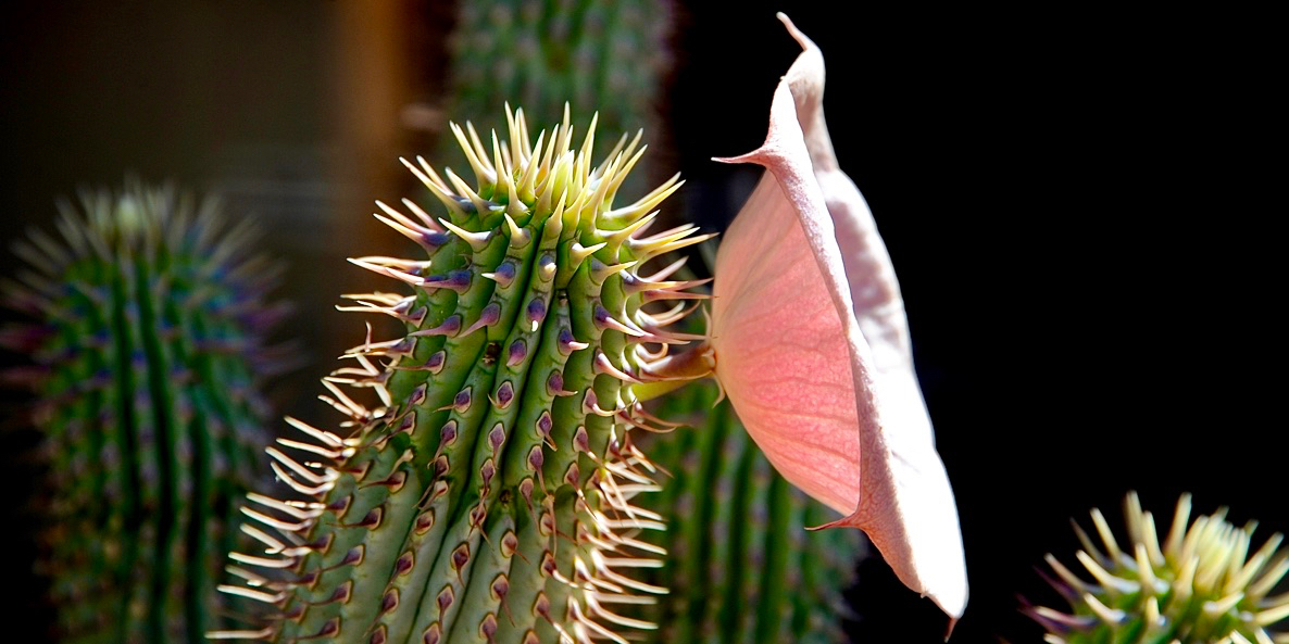
Hoodia Inspired
The shape elements reflected within the AridEden logo were inspired by the Hoodia plant, a resilient and endemic euphorbia that grows in Namibia’s arid environments of the Namib, Hardap and Kalahari.
Whilst the flower determines the logo's overall form (like a transparent pentagon), the five main strands / 'petals' correspond with our 5Cs sustainability framework.
At its 'heart, the ‘happy being’ figure resembles Hoodia seedlings as they grow out of fertile ground into the light, bursting with joy and energy. Like the initiatives of our vision, a pod filled with many seeds sows hope for germination that brings new life. So fitting!